Sections and blocks
Change each section of the home page, add, move, hide and remove sections, change the header and footer, and add blocks to a section.
A page in the theme editor is made of sections, stacked from top to bottom. Some sections hold smaller parts called blocks. This page shows each section of the starter theme’s home page, and how to add, move, hide and remove them.
Open the theme editor first (see The theme editor).
The home page’s sections
The starter theme’s home page has four sections, under Home page in the section list:
| Section | What it shows |
|---|---|
| Hero banner | A big banner with a picture, a heading, words and buttons (see The theme editor) |
| Featured collection | Products from one collection |
| Image with text | A picture next to a heading and words |
| Rich text | A heading and words on their own |
Above them is the Header group (the Header at the top of every page), and below them the Footer group (the Footer at the bottom of every page).
Featured collection
Press Featured collection. Its settings:
| Box | What it does | Example |
|---|---|---|
| Heading | The words above the products | Our best sellers |
| Collection | Which collection’s products to show. Press Choose | Best sellers |
| Products to show | How many products, from 2 to 12 | 8 |
| Products per row on desktop | How many products side by side on a computer, from 2 to 5 | 3 |
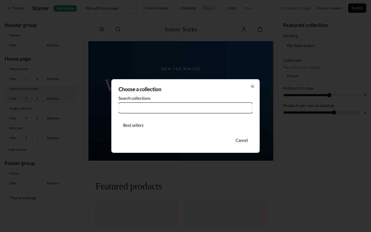
When you press Choose, the Choose a collection window lists your collections. Type in Search collections to find one, and press its name.
The collection’s handle shows under Collection (here best-sellers), with Change and Remove. The preview shows its products, three to a row:
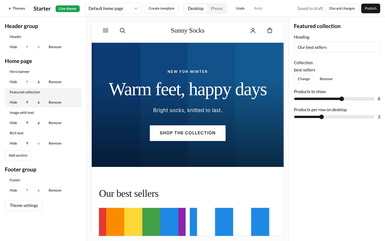
Image with text
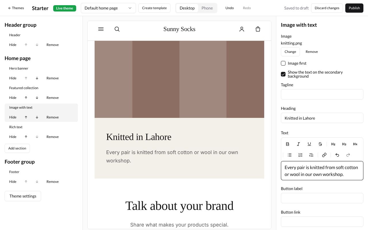
Press Image with text. It has an Image (press Choose), Image first (ticked, the picture is on the left; not ticked, on the right), Show the text on the secondary background (a coloured panel behind the words), Tagline, Heading, Text, Button label and Button link.
Here the picture is knitting.png, Image first is not ticked, the heading is Knitted in Lahore and the text Every pair is knitted from soft cotton or wool in our own workshop.
Add a section
-
Press Add section under the list of the page’s sections.
-
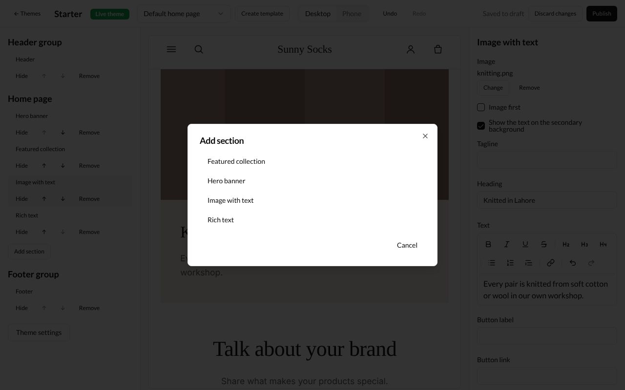
The Add section window lists the sections you can add: Featured collection, Hero banner, Image with text and Rich text. Press one, here Rich text.
-
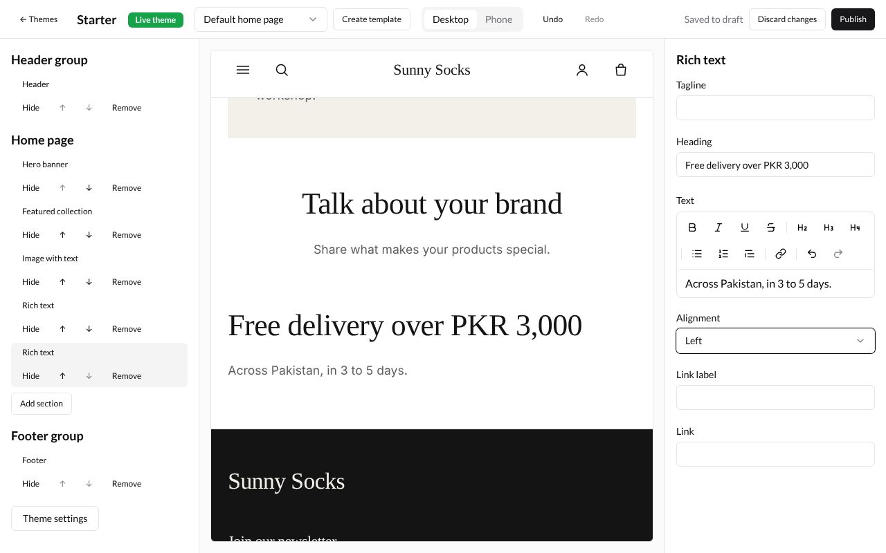
The new section is added at the bottom of the page and its settings open. A Rich text has a Tagline, Heading, Text, Alignment (Left or Center), Link label and Link. Here:
Free delivery over PKR 3,000,Across Pakistan, in 3 to 5 days.and Left.
Move a section
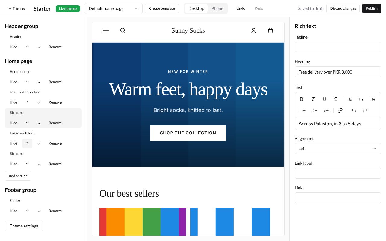
Each section has two arrow buttons under its name. Press ↑ to move it up one place, or ↓ to move it down. An arrow is grey where the section can’t move further.
Here the new Rich text is moved up twice, so it sits between Featured collection and Image with text:
Hide a section
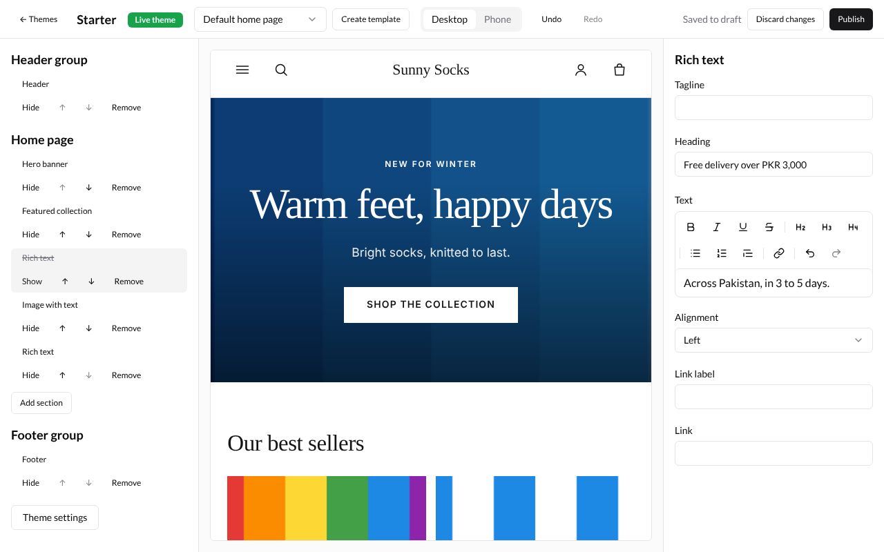
Press Hide under a section. Its name is crossed out, the button changes to Show, and buyers don’t see it, but its settings are kept. Press Show to bring it back.
Remove a section
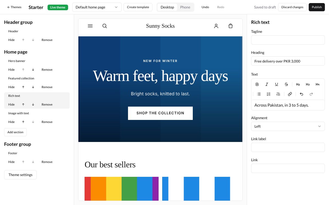
Press Remove under a section to take it off the page, with its settings. Here the theme’s own Rich text (with Talk about your brand) is removed, so only the new one is left. If you remove one by mistake, press Undo.
The header
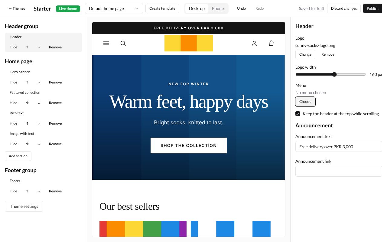
Press Header under Header group. It is on every page.
| Box | What it does | Example |
|---|---|---|
| Logo | A picture instead of the store’s name. Press Choose | sunny-socks-logo.png |
| Logo width | How wide the logo is, from 60 to 240 px | 160 px |
| Menu | Which menu shows across the top. Press Choose to pick one of your menus (see Menus). Left empty, the theme uses the menu with the handle main-menu |
(empty) |
| Keep the header at the top while scrolling | Ticked, the header stays in view as buyers scroll down | ticked |
| Announcement text | A line in a bar above the header | Free delivery over PKR 3,000 |
| Announcement link | Where the bar goes when pressed | (blank) |
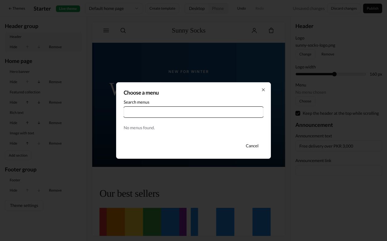
When you press Choose under Menu, the Choose a menu window lists your menus. This store has none yet, so it says No menus found.
The footer
Press Footer under Footer group.
| Box | What it does |
|---|---|
| Menu | Which menu shows in the footer. Left empty, the theme uses the menu with the handle footer |
| Text | Words under the store’s name, such as your address |
| Show the newsletter signup | Shows the Join our newsletter box, where buyers type their email address |
| Heading and Text (under Newsletter) | The newsletter box’s words. Leave blank for the theme’s own heading. and Leave blank for the theme’s own text. |
| Show payment icons | Shows the icons of the ways buyers can pay |
| Show Powered by RetailPrime | Shows Powered by RetailPrime at the very bottom |
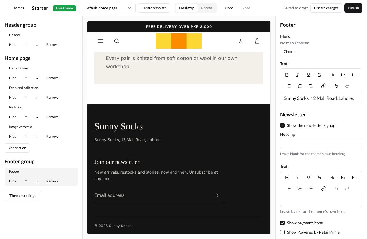
Here the Text is Sunny Socks, 12 Mall Road, Lahore. and Show Powered by RetailPrime is not ticked:
Blocks
A block is a part inside a section. In the starter theme, the product page’s Product information section takes blocks called Collapsible tab: a heading buyers press to open more words, such as a size guide.
-
In the Template list, pick Default products under Products. The preview shows one of your products.
-
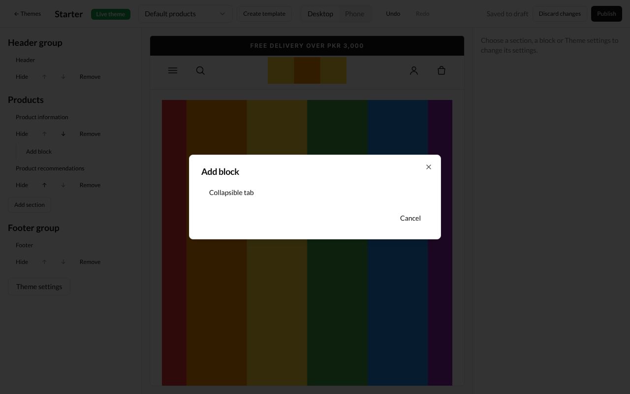
Under Product information, press Add block. The Add block window lists Collapsible tab. Press it.
-
The block shows under Product information, pushed to the right, with its own Hide, arrows and Remove. Its settings open:
| Box | What it does | Example |
|---|---|---|
| Heading | The tab’s title | Size guide |
| Content | The words inside the tab | (blank) |
| Content from a page | Uses a page’s words instead. Press Choose | Size guide |
| Open by default | Ticked, the tab starts open | ticked |
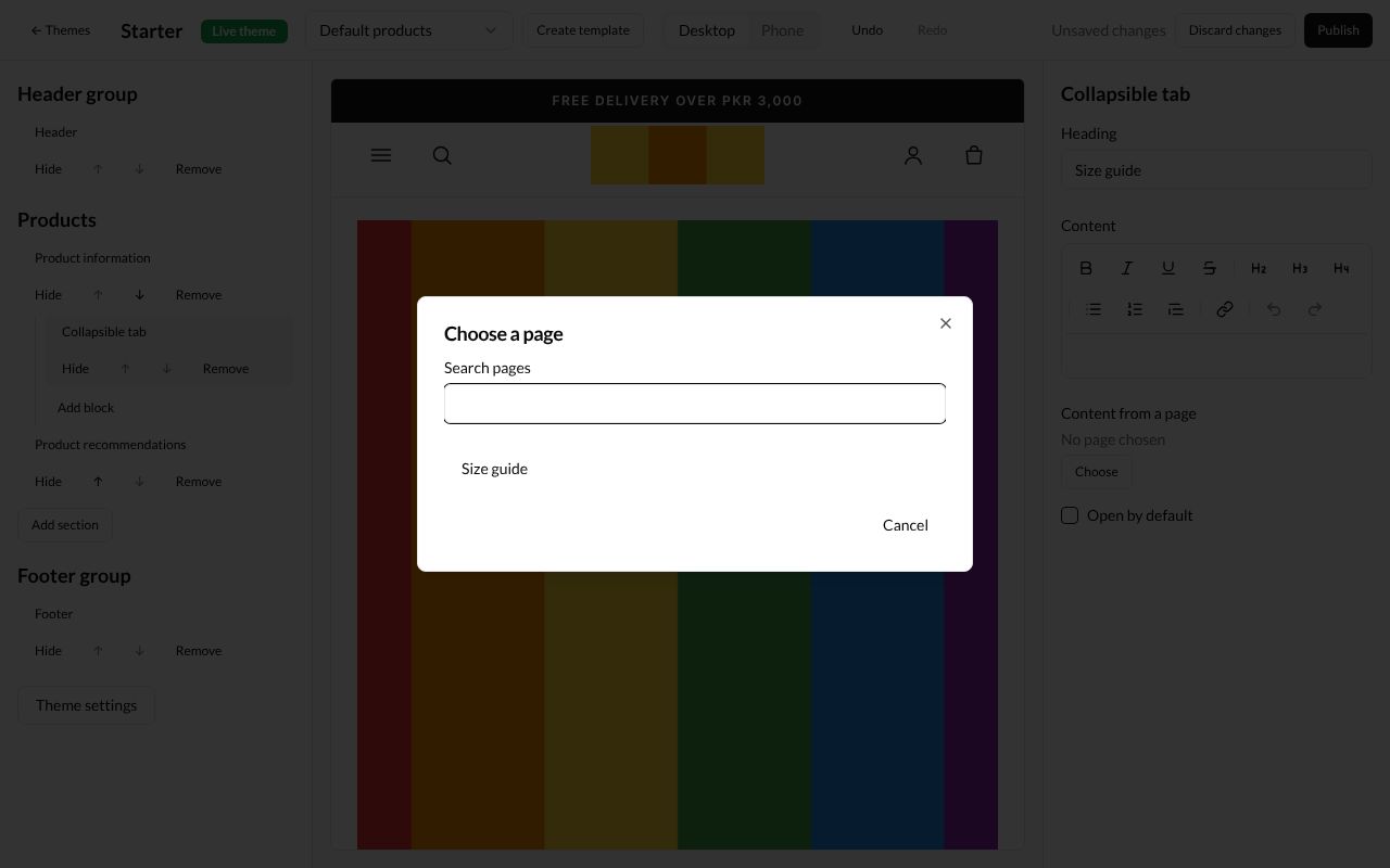
When you press Choose under Content from a page, the Choose a page window lists your pages (see Pages). Press one.
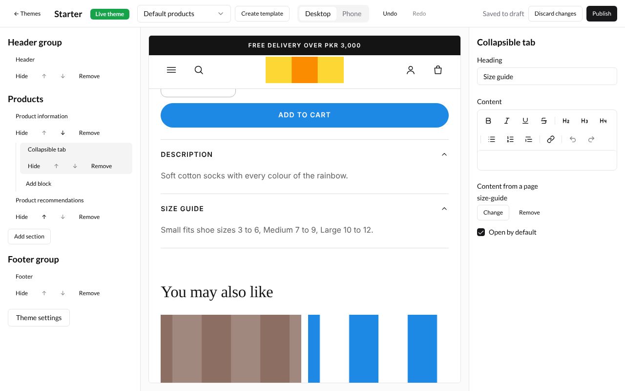
The preview shows the tab under the product’s description, open, with the page’s words:
A section can hold up to six of these blocks. Blocks are hidden, moved and removed like sections.
What’s next
Theme settings, templates and publishing: change colours and fonts, and show your changes to buyers.